Line chart

A line chart or line graph displays the evolution of one or several numeric variables. This page is a step-by-step guide on how to build your own line chart component for the web, using React and D3.js.
It starts by describing how the data should be organized and how to initialize the react component. It then explains how to compute the scales, and axes. Once this is done, it shows how to render the lines and suggests a few variations. 🙇♂️.
The Data
The dataset required to build a line chart is usually an array where each item is an object providing the x and the y values of the data point.
Here is a minimal example:
const data = [
  {x:1, y: 90},
  {x: 2, y: 12},
  {x: 3, y: 34},
  {x: 4, y: 53},
  {x: 5, y: 98},
]Note: if your data is in .csv format, you can translate it thanks to the d3.csv() function as suggested here.
Note: a line chart is often made to represent time. If your x property is a date, please visit the timeseries section.
Component skeleton
The goal here is to create a LineChart component that will be stored in a LineChart.tsx file. This component requires 3 props to render: a width, a height, and some data.
The shape of the data is described above. The width and height will be used to render an svg element in the DOM, in which we will insert the LineChart.
To put it in a nutshell, that's the skeleton of our LineChart component:
import * as d3 from "d3"; // we will need d3.js

type LineChartProps = {
  width: number;
  height: number;
  data: {x: number, y: number}[];
};

export const LineChart = ({ width, height, data }: LineChartProps) => {

  // read the data
  // build the scales and axes
  // build the lines

  return (
    <div>
      <svg width={width} height={height}>
        // render axes
        // render all the <path>
      </svg>
    </div>
  );
};
It's fundamental to understand that with this code organization, d3.js will be used to prepare the SVG path, but it's React that will render them in the return() statement. We won't use d3 methods like append that you can find in usual d3.js examples.
Scales and Axes
Like for many charts, everything starts with scales. A scale is a function that transform the value of a data point in a position in pixel.
Two scales are required here. One for the X axis, and one for the Y axis. They are both linear scales.
This concept of scale is thoroughly described in other chart type pages like for the scatterplot so I won't repeat it here. Also, dealing with the Date format shoud drive you to the timeseries section.
The d3.line() function
From the dataset described above, we want to draw a line in SVG. In the DOM this is done using a path element that has a d attribute.
Fortunately, d3.js offers the d3.line() function that helps us doing this. d3.line() is a function that returns a function. It can be invoked this way:
const lineBuilder = d3
  .line()
  .x((d) => xScale(d.x))
  .y((d) => yScale(d.y));
Here 2 accessor functions are provided. An accessor function tells to d3 how to find the position in pixel of a datapoint based on an item of the initial dataset.
lineBuilder is now a function that expects a dataset as input and returns a SVG path from it.
const linePath = lineBuilder(data);

// console.log(linePath)
// 'M31.02,26.99 L63.02,59.9 L287.1,194.4 L319,178.2'
This path can easily be plotted as shown in the following section. 🎉
Most basic line chart
Most of the job is done already. It is just a matter of passing the path computed above to the SVG element. Something like this:
<svg width={width} height={height}>
  <g ...some translation >
    <path
      d={linePath}
      stroke="#9a6fb0"
      fill="none"
      strokeWidth={2}
    />
  </g>
</svg>
Leading to our first line chart! 🔥
Most basic line chart made with react (rendering) and d3.js (path computation)
Note: you can compare this with a d3.js only approach
Responsive Line chart with react
The component above is not responsive. It expects 2 props called width and height and will render a Line chart of those dimensions.
Making the Line chart responsive requires adding a wrapper component that gets the dimension of the parent div, and listening to a potential dimension change. This is possible thanks to a hook called useDimensions that will do the job for us.
useDimensions: a hook to make your viz responsive
export const useDimensions = (targetRef: React.RefObject<HTMLDivElement>) => {

  const getDimensions = () => {
    return {
      width: targetRef.current ? targetRef.current.offsetWidth : 0,
      height: targetRef.current ? targetRef.current.offsetHeight : 0
    };
  };

  const [dimensions, setDimensions] = useState(getDimensions);

  const handleResize = () => {
    setDimensions(getDimensions());
  };

  useEffect(() => {
    window.addEventListener("resize", handleResize);
    return () => window.removeEventListener("resize", handleResize);
  }, []);

  useLayoutEffect(() => {
    handleResize();
  }, []);

  return dimensions;
}
I'm in the process of writing a complete blog post on the topic. Subscribe to the project to know when it's ready.
Line chart inspiration
If you're looking for inspiration to create your next Line chart, note that dataviz-inspiration.com showcases many examples. Definitely the best place to get ... inspiration!
dataviz-inspiration.com showcases hundreds of stunning dataviz projects. Have a look to get some ideas on how to make your Line chart looks good!
visitTransition
How can we smoothly animate the transition between 2 datasets on a line chart? Click on the buttons on top of the chart below to trigger an animation between 2 groups of a dataset.
This is possible thanks to the react spring library. Basically, instead of rendering usual a path element, the library provides an animated.path element, that is linked to a useSpring hook.
This is what the LineItem component I use looks like:
LineItem: a component that animates the transition of a path
type LineItemProps = {
  path: string;
  color: string;
};

const LineItem = ({ path, color }: LineItemProps) => {
  const springProps = useSpring({
    to: {
      path,
      color,
    },
    config: {
      friction: 100,
    },
  });

  return (
    <animated.path
      d={springProps.path}
      fill={"none"}
      stroke={color}
      strokeWidth={2}
    />
  );
};Click on the buttons to trigger a smooth transition between the 2 line charts.
Animation in dataviz using React is a big topic. It's impossible to go in-depth here! I will publish a dedicated blog post on the topic soon. Please subscribe to the newsletter if you want to be notified.
Variations
You now have the basic understanding on how to build a basic line chart component with React and d3.js. Below are a few examples showing how to build more complex graphs based on those principles.
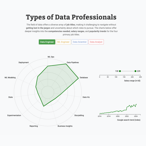
Radar chart, line chart an lollipop with animated transition
Three charts connected to same buttons, with smooth, synchronized animation when a button is clicked
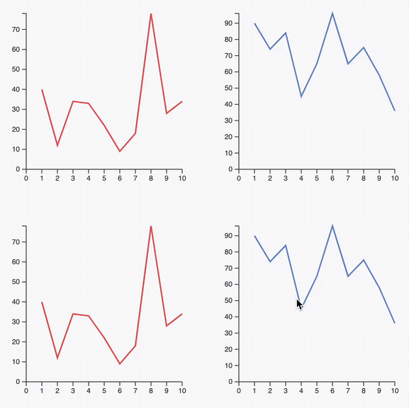
Synchronized cursors
Add a cursor synchronized on all your charts
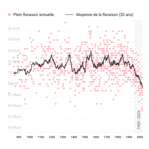
Timeseries with moving average
A scatterplot used for timeseries, with the moving average shown as a line chart on top.
Next
The react graph gallery is under heavy development. Here is a list of things that will be added soon.
ToDoHow to add a tooltip
ToDoMulti groups line charts aka Spaghetti chart
ToDoSync with a bar chart
ToDoDual Y Axis
ToDoInline legend with Reppel
Subscribe to the gallery to know when it is ready!
Subscribe


Contact
👋 Hey, I'm Yan and I'm currently working on this project!
Feedback is welcome ❤️. You can fill an issue on Github, drop me a message on Twitter, or even send me an email pasting yan.holtz.data with gmail.com. You can also subscribe to the newsletter to know when I publish more content!