Timeseries

This section does not target a specific chart type, even though timeseries are often represented as line charts or area charts.
Instead, it provides a tips and tricks to deal with charts that represent the evolution in time of a numeric variable. For instance, it provides hints on how to deal with dates, how to pan on a chart and more
Useful chart types
This page is not about a specific chart type. Instead it provides hints on how to deal with time.
Check the graph sections that are used to visualize timeseries below if there is a specific chart type you want to make.
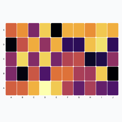
Basic heatmap
Most basic heatmap
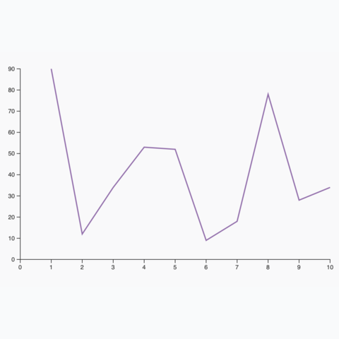
Most basic line chart
The most basic line chart one can make using d3 and react
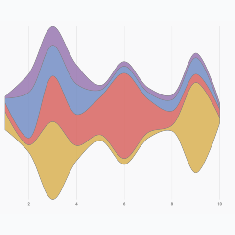
Basic Streamgraph
Most basic streamgraph one can build using d3 and react
The Date format
The first struggle when dealing with timeseries is to work with the javascript Date format. A Date represents a single moment in time and is usually stored as a string in the input dataset.
Here is an FAQ about the Date format. I constantly forget how this works and come back here for reference. Note that it heavily relies on the d3-time-format module that provides great helpers.
Transform a string into a date
In your dataset, the date of each data point is probably stored as a string, like 2015-06-01 for instance.
In order to manipulate and plot those dates, you need to transform it into a javascript date format.
// import the timeParse function from d3
import { timeParse } from "d3";

// create a time parser function that works for our time format
const customTimeParser = timeParse("%Y-%m-%d");

// convert a string into a date
const string = "2015-06-01"
const date = customTimeParser(string)

// console.log(date)
// Mon Jun 01 2015 00:00:00 GMT+0200 (Central European Summer Time)
}
Transform a date into a string
Once you have a timestamp at the Date format, you might want to display it on the screen using a specific format.
// import the timeParse function from d3
import { timeFormat } from "d3";

// create a time parser function that works for our time format
const customTimeFormatter = timeFormat("%B %d, %Y");

// convert a string into a date
const date = new Date
const string = customTimeFormatter(date)

// console.log(string)
// "June 30, 2015"
}
What is the current date
You can use the Date.now() function. Note that the date is returned as a number.
const now = Date.now()

// console.log(now)
// 1685004151406

const nowInDateFormat = new Date(now)

// console.log(nowInDateFormat)
// Thu May 25 2023 10:42:31 GMT+0200 (Central European Summer Time)
}
Building a time axis
A very common task when it comes to build timeseries viz is to draw a time axis. Fortunately, d3 has amazing helper functions allowing to create and draw temporal scales.
All the magic is stored in the d3-scale module, and more precisely in the scaleTime function.
Building a time scale can be summarized as follow:
// Start and end of the axis must be in the Date format
const start = new Date("2020-12-01");
const end = new Date("2023-06-01");

// Use scaleTime() to create a time scale
const xScale = d3.scaleTime()
  .domain([start, end])
  .range([0, width]);
Following this code block xScale is a function. You give it a Date, it returns a position in pixels
You can finally use this scale to draw the X axis using your favorite method:
- create your own react component
- call
d3.axisBottom()in auseEffect
I'm preparing a full post on axes with d3 and react, subscribe to the newsletter if you want to be notified when it's out!
More on axesA basic time axis build with d3.js and react.
d3 is very smart at picking the right label format. If you're dealing with a very long period of time (years), it will display years. If you're dealing with a month, it will display days. And so on. It is very convenient. The logic controlling this formatting is provided here.
Note that you can customize how dates are formatted along the X axis thanks to the tickFormat function.
Line chart application
If you already understood the content of the line chart section of the gallery, you just have to use a scaleTime instead of a scaleLinear and that's it, you have your first timeseries visualization. 😋
A first timeseries line chart made thanks to the scaleTime function of d3.
Synchronized cursor
Another pretty common task when dealing with timeseries is to add a synchronized cursor on all charts.
This makes the dashboard more insightful: hovering over an interesting part of a chart reveals where the timestamp is localized on other charts instantly.
The implementation required to build a shared state between all charts of the webpage. Hovering a specific chart will update this state and thus update all other plots. This process is extensively described in this synchronized cursor for timeseries post.
Read full postHover over a chart to see a cursor on both of them, easing the time comparison.
Gallery of timeseries example
On top of the generic use-cases presented above, here is a gallery of chart examples involving timeseries visualization:


Contact
👋 Hey, I'm Yan and I'm currently working on this project!
Feedback is welcome ❤️. You can fill an issue on Github, drop me a message on Twitter, or even send me an email pasting yan.holtz.data with gmail.com. You can also subscribe to the newsletter to know when I publish more content!