Streamchart
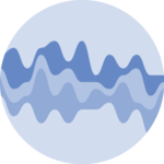
A streamgraph is a variation of the more common stacked area chart. It rounds edges and displays areas around the central axis which gives a nice impression of flow.
This section explains how to stack and smooth the data with d3.js, and render the shapes with react. It starts from the basic and goes until necessary customization like tooltips, hover effect, legend and annotation. Examples always come with editable sandboxes.
The Data
Most of the time the input dataset is an array where each item is an object.
Each object provides information for a step on the X axis. It has a value like x or date that provides the exact position on the X axis. Then it has several numeric values, one for each group of the dataset.
Here is a minimal example:
const data = [
  {
    x: 1,
    groupA: 38,
    groupB: 19,
  },
  {
    x: 2,
    groupA: 16,
    groupB: 14,
  },
  ...
];
→ Wide and Long formats
The format described above is often called the wide format. Another common format is the long format, where each object in the array provides information for 1 group only. (The array becomes way longer 🙃)
If your dataset is formatted using the long format, you can transform it using the pivotWider function below:
Pivot function
type LongDataItem = {
  date: string;
  group: string;
  value: number;
};

type WideDataItem = {
  date: string;
} & { [key: string]: number }

const pivotWider = (data: LongDataItem[]) => {
  const result: WideDataItem[] = [];

  data.forEach((item) => {
      const existingEntry = result.find((entry) => entry.date === item.date);

      if (existingEntry) {
          existingEntry[item.group] = item.value;
      } else {
          const newEntry = { date: item.date };
          newEntry[item.group] = item.value;
          result.push(newEntry);
      }
  });

  return result;
}
→ .csv data
If your data is in .csv format, you can translate it thanks to the csvParse() function of d3. I'll write a blogpost soon on how to deal with the csv format. Subscribe to the project to know when it is ready!
ToDoAdd some more hints on how to type those data objects
Component skeleton
The goal here is to create a StreamGraph component that will be stored in a StreamGraph.tsx file. This component requires 3 props to render: a width, a height, and some data.
The shape of the data is described above. The width and height will be used to render an svg element in the DOM, in which we will insert the graph.
To put it in a nutshell, that's the skeleton of our StreamGraph component:
import * as d3 from "d3"; // we will need d3.js

type WideDataItem = {
  date: string;
} & { [key: string]: number }

type StreamGraphProps = {
  width: number;
  height: number;
  data: WideDataItem[];
};

export const StreamGraph = ({ width, height, data }: StreamGraphProps) => {

  // read the data
  // find the list of groups to display
  // stack the data
  // build the shapes

  return (
    <div>
      <svg width={width} height={height}>
        // render all the shapes
      </svg>
    </div>
  );
};
It's fundamental to understand that with this code organization, d3.js will be used to prepare the SVG circle, but it's React that will render them in the return() statement. We won't use d3 methods like append that you can find in usual d3.js examples.
Stacking series
Building a stream chart requires to stack the data. Series are displayed one on top of each other and you have to compute their positions on the Y axis.
Fortunately, D3.js has a handy stack() function that does exactly that. The process is deeply explained in the stacked area chart section of the gallery.
The only variation required here is to use the d3.stackOffsetSilhouette offset option. Instead of stacking everything above the 0 baseline, it will put groups on both parts of it.
Computing the position of the chart series should look something like:
const stackSeries = d3
  .stack()
  .keys(groups)
  .order(d3.stackOrderNone)
  .offset(d3.stackOffsetSilhouette);
const series = stackSeries(data);
Basic streamgraph example
Once more, the process to render the shape is very close to the stacked area chart. A few variations are required though.
→ Smoothing
We need to smooth the area shape to get the good-looking organic flow. Once more d3 is here to the rescue with a curve function that does all the work for us.
This is how to call the curve function and the end of the area function call:
const areaBuilder = d3
  .area()
  .x(d => xScale(x))
  .y1(d => yScale(d[1]))
  .y0(d => yScale(d[0]))
  .curve(curveCatmullRom);
→ Axis
Usual axes do not work for streamgraphs. The Y axis would make no sense since shapes are on both side of the 0 baseline. It is commonly removed. The X axis would feel lost alone at the very bottom of the chart.
Here I suggest to replace the X axis with vertical ablines and remove the Y axis completely.
Most basic streamgraph with react and d3.js
Responsive Streamgraph with react
The component above is not responsive. It expects 2 props called width and height and will render a Streamgraph of those dimensions.
Making the Streamgraph responsive requires adding a wrapper component that gets the dimension of the parent div, and listening to a potential dimension change. This is possible thanks to a hook called useDimensions that will do the job for us.
useDimensions: a hook to make your viz responsive
export const useDimensions = (targetRef: React.RefObject<HTMLDivElement>) => {

  const getDimensions = () => {
    return {
      width: targetRef.current ? targetRef.current.offsetWidth : 0,
      height: targetRef.current ? targetRef.current.offsetHeight : 0
    };
  };

  const [dimensions, setDimensions] = useState(getDimensions);

  const handleResize = () => {
    setDimensions(getDimensions());
  };

  useEffect(() => {
    window.addEventListener("resize", handleResize);
    return () => window.removeEventListener("resize", handleResize);
  }, []);

  useLayoutEffect(() => {
    handleResize();
  }, []);

  return dimensions;
}
I'm in the process of writing a complete blog post on the topic. Subscribe to the project to know when it's ready.
Hover effect
It is pretty hard to follow the evolution of a specific group on a streamgraph.
It is common to add an hover effect to the figure: hovering over a group will highlight it, making it easier to follow its evolution. Try it on the graph below:
StreamGraph with hover effect that highlights a specific series
There are various strategies to implement such an hover effect.
Here, I suggest to do everything in css using pseudo classes, and targetting svg elements only. Basically, everything in the svg container will be dimmed (lower opacity and saturation) when the mouse goes over the chart. But the specific shape that is hovered over will keep its full opacity thanks to a more specific css selector.
Another common challenge is to connect the streamgraph with another UI element. Here is an example connecting it with a barplot:
There are several strategies to implement hover effect. If you're not exactly sure what you're doing, I highly recommend reading the hover effect section of the gallery first.
Streamgraph inspiration
If you're looking for inspiration to create your next Streamgraph, note that dataviz-inspiration.com showcases many examples. Definitely the best place to get ... inspiration!
dataviz-inspiration.com showcases hundreds of stunning dataviz projects. Have a look to get some ideas on how to make your Streamgraph looks good!
visitStreamgraph algorithm with transition
Our streamgraph is renderer using a set of path. The d attribute of those paths provides the boundary coordinates of those paths.
When a prop of the StreamGraph component updates, we might want to update the paths to represent the latest state of our application. It can be an update of the dataset, or an update of the function used to stack the data or smooth the area as below.
It is possible to smoothly animate this transition thanks to react-spring.
Try d3.js various options to offset the data and smooth shapes. See a smooth transition between options.
The animation suggested above is a bit tricky to implement. Indeed, we need to transition from paths that do not have the same number of edges. It is possible thanks to a library called flubber but definitely deserves its own blogpost.
I'll publish a full blogpost on the topic soon!
Get notifiedToDofind why flubber does some weird interpolation in some cases
Application
The following chart is a real-life application of a streamgraph. It shows the evolution if the number of page-views for 5 tech websites in the last 7 years. My goal was to assess if the rise of chat-GPT had an impact on it.
This interactive chart has several interesting features:
- slider: you can control the displayed time-frame thanks to a slider.
- inline legend: label of each series are written inline. A background proportional to their value provides additional insight.
- hover effect: legend will be updated with precise values at the hovered timestamp.
A customized streamgraph built with React and D3.js. It has inline legends, slider to control timeframe, hover effect and more.


Contact
👋 Hey, I'm Yan and I'm currently working on this project!
Feedback is welcome ❤️. You can fill an issue on Github, drop me a message on LinkedIn, or even send me an email pasting yan.holtz.data with gmail.com. You can also subscribe to the newsletter to know when I publish more content!
