Bubble Map

A bubble map uses circles of different size to represent a numeric value on a territory. It displays one bubble per geographic coordinate, or one bubble per region.
This page explains how to build bubble maps for the web using d3.js and react. Several tools can be used to display the background map as shown in the dedicated section. Circles are then computed with d3 and render using SVG or canvas elements with react.
Examples start easy and add layers of complexity progressively. You will always find explanations and code sandboxes for each step.
The Data
Two pieces of information are required to build a bubble map:
→ Geographic information
The first thing you need is the 2d coordinates of the boundaries of the regions you want to represent. If you are trying to build a world map, you need to know where the country boundaries are located 🤷♀️.
Several formats exist to store such a piece of information. When working with d3.js, the expected format is geoJSON. A geoJSON file looks pretty much like this:
{
  "type": "FeatureCollection",
  "features": [
    {
      "type": "Feature",
      "geometry": {
        "type": "Point",
        "coordinates": [102.0, 0.5]
      },
      "properties": {
        "prop0": "value0"
      }
    },
    {
      "type": "Feature",
      "geometry": {
        "type": "LineString",
        "coordinates": [
          [102.0, 0.0],
          [103.0, 1.0],
          [104.0, 0.0],
          [105.0, 1.0]
        ]
      },
      "properties": {
        "prop0": "value0",
        "prop1": 0.0
      }
    },
    ...
  ]
}
It is basically an object, with a features property that is of great interest. This prop is an array, each item of the array being a shape that we will be able to draw.
This format is extensively described in the background map section of the gallery. It explains how it is structured, where to find it, how to work with it and how to draw its content. Check it out!
Map section→ Numeric information
We need another piece of information that provides a numeric value for each region of the geoJson file. This information will encode the sizeof the bubbles.
You can include any information in this array. But you need a prop (code here) that allows to make the link with the regions of the geoJson file.
[
{
"name": "Antigua and Barbuda",
"code": "ATG",
"pop": 83039
},
{
"name": "Algeria",
"code": "DZA",
"pop": 32854159
},
...
]
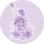
}Basic background map
The first step is to build the background map. Basically, we need to transform the set of spherical coordinates of the geoJson file into a set of 2d coordinates and draw them.
Fortunately, the d3-geo module of d3.js has everything we need for this. It relies on the d3.geoPath() function and the whole process is extensively described in the background map section of the gallery.
First very basic map made with d3.js and React. Check the map section for more code explanation.
Note: I removed Antartica and chose the most famous yet highly criticiced: Mercator.
Adding the bubbles
Now, we need to add a bubble on top of each country to represent its population.
The process is very close to what is described in the bubble chart section of the gallery. So please take a look there for more in-depth explanations.
Bubble chart sectionWe need a scale to translate the numeric value of a data point into the radius of its circle. This is made possible thanks to the scaleSqrt() function that can be used as follow:
const sizeScale = d3
  .scaleSqrt()
  .domain([min, max])
  .range([BUBBLE_MIN_SIZE, BUBBLE_MAX_SIZE]);
Once this sizeScale is available, I can loop through all items of my dataset and draw a SVG circle for each. From each point value, sizeScale will provide me the radius that I can pass to the r attribute of the circle SVG element.
We also need to find the x and y 2d coordinates of each circle. There are 2 use cases for this:
- circle at the center of the region: it is possible to determine the position of the baricenter of each region of the geoJson file thanks to the
centroid()function of the path generator. See the world bubble map below. - circle at precise GPS coordinates: sometimes the data containing the numeric value of each bubble also provides the gps coordinates where it needs to be drawn. Note that in this case those coordinates must be translated for the current projection! (see the transition section below)
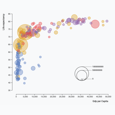
A very simple bubble chart made using d3.js and react, based on a geoJson file.
Bubble legend
There are many different ways to add a legend to a d3.js graph. What we mainly need here is to make sense of the bubble size. I suggest using a set of nested bubbles, showing a few of the bubble sizes used on the chart with their respective values.
A legend to make sense of circle size, based on a d3 scale.
This legend is implemented in a BubbleLegend component that expects 2 props:
scale: the size scale that we described above, built with thescaleSqrtfunction.tickNumber: the number of circles to show on the legend.
Note that tickNumber is a target. The legend component uses the tick() function with this value, which returns a smart number of circle to approximate the goal while keeping some nice, smart values.
You can check the complete implementation of the legend here:
BubbleLegend: a component to build a legend for circle sizes
type BubbleLegendProps = {
  scale: d3.ScaleLinear<number, number, never>;
  tickNumber: number;
};

export const BubbleLegend = ({ scale, tickNumber }: BubbleLegendProps) => {
  const ticks = scale.ticks(tickNumber);
  const maxValue = ticks[ticks.length - 1];

  const diameter = scale(maxValue) * 2; // diameter of the biggest circle

  const dashWidth = diameter / 2 + 10;

  const allCircles = ticks.map((tick, i) => {
    const xCenter = diameter / 2;
    const yCircleTop = diameter - 2 * scale(tick);
    const yCircleCenter = diameter - scale(tick);

    return (
      <g key={i}>
        <circle
          cx={xCenter}
          cy={yCircleCenter}
          r={scale(tick)}
          fill="none"
          stroke="black"
        />
        <line
          x1={xCenter}
          x2={xCenter + dashWidth}
          y1={yCircleTop}
          y2={yCircleTop}
          stroke="black"
          strokeDasharray={"2,2"}
        />
        <text
          x={xCenter + dashWidth + 4}
          y={yCircleTop}
          fontSize={10}
          alignmentBaseline="middle"
        >
          {tick}
        </text>
      </g>
    );
  });

  return (
    <svg width={diameter} height={diameter} overflow="visible">
      {allCircles}
    </svg>
  );
};
It's important to note that the component does not expect any dimension as prop. The width and height of the SVG element that is created will be computed from the scale that is provided.
As a result, you only need to think about the position of the legend on your chart. Check a few example of charts using this component.
Responsive Bubble with react
The component above is not responsive. It expects 2 props called width and height and will render a Bubble of those dimensions.
Making the Bubble responsive requires adding a wrapper component that gets the dimension of the parent div, and listening to a potential dimension change. This is possible thanks to a hook called useDimensions that will do the job for us.
useDimensions: a hook to make your viz responsive
export const useDimensions = (targetRef: React.RefObject<HTMLDivElement>) => {

  const getDimensions = () => {
    return {
      width: targetRef.current ? targetRef.current.offsetWidth : 0,
      height: targetRef.current ? targetRef.current.offsetHeight : 0
    };
  };

  const [dimensions, setDimensions] = useState(getDimensions);

  const handleResize = () => {
    setDimensions(getDimensions());
  };

  useEffect(() => {
    window.addEventListener("resize", handleResize);
    return () => window.removeEventListener("resize", handleResize);
  }, []);

  useLayoutEffect(() => {
    handleResize();
  }, []);

  return dimensions;
}
I'm in the process of writing a complete blog post on the topic. Subscribe to the project to know when it's ready.
Smooth dataset transition
How can we smoothly animate the transition between 2 datasets on a bubble chart? The chart used in this blog post can be drawn for several different years. You can use the select button on top to select the year, and the bubbles will animate to their new size.
This is possible thanks to the react spring library. Basically, instead of rendering usual circle elements, the library provides an animated.circle element, that is linked to a useSpring hook.
This is what the Circle component I use looks like:
Circle: a component that animates the transition of a circle
import { useSpring, animated } from "@react-spring/web";

type CircleProps = {
  color: string;
  r: number;
  cx: number;
  cy: number;
};

export const Circle = (props: CircleProps) => {
  const { cx, cy, r, color } = props;

  const springProps = useSpring({
    to: { cx, cy, r },
    config: {
      friction: 30,
    },
    delay: 0,
  });

  return (
    <animated.circle
      cx={springProps.cx}
      cy={springProps.cy}
      r={springProps.r}
      opacity={0.7}
      stroke={color}
      fill={color}
      fillOpacity={0.3}
      strokeWidth={1}
    />
  );
};
A bubble chart component that smoothly animates changes between datasets.
Animation in dataviz using React is a big topic. It's impossible to go in-depth here! I will publish a dedicated blog post on the topic soon. Please subscribe to the newsletter if you want to be notified.
Bubble inspiration
If you're looking for inspiration to create your next Bubble, note that dataviz-inspiration.com showcases many examples. Definitely the best place to get ... inspiration!
dataviz-inspiration.com showcases hundreds of stunning dataviz projects. Have a look to get some ideas on how to make your Bubble looks good!
visit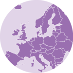

Contact
👋 Hey, I'm Yan and I'm currently working on this project!
Feedback is welcome ❤️. You can fill an issue on Github, drop me a message on Twitter, or even send me an email pasting yan.holtz.data with gmail.com. You can also subscribe to the newsletter to know when I publish more content!